

Everything in View
Its position on the menubar makes it easy to see what’s currently playing on iTunes. Just from the corner of the eye.
Doesn’t fit, doesn’t exist!
In case an Information is too long to fit into the ticker on one line, it’s smoothly scrolled to the left , so you can read everything without problems. New lines will be pushed in gently from the bottom.


As you like
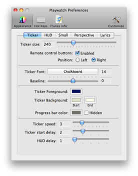
With the Dialog, shown to the right, it’s possible to change the appearance of the Ticker, the way you like it most:
-
•Size
-
•Remote-Control On/Off
-
•Font & Color
-
•Color & visibility of the time progress bar
-
•Speed & Delay for Ticker and other effects


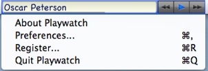
Just click into the Ticker, to show the Playwatch menu. The menu provides different entries, to easily access the “Preferences-Dialog”, or start the registering process after you’ve purchased a license-key. You can also get further information about the Version you are currently using and there is an entry to quit Playwatch.

Progress made visible
On the bottom edge of the Ticker, you can see a thin bar or line. This bar is used to inform you, about how many time of current track has elapsed and how many is remaining. After the bar reaches the right edge of the Ticker, the track is at it’s end. Visibility and Color of this Time-Progress-Bar, can be set to any values you like.


No need to search the Dock or the Programs- Folder. Just use the Playwatch menu entry “Launch iTunes...” to start iTunes.


Ticker much bigger
In order to meet the screen sizes of todays Macs, the maximum size of the Ticker was significantly increased. It can now be 800 instead of 200 Pixel.

